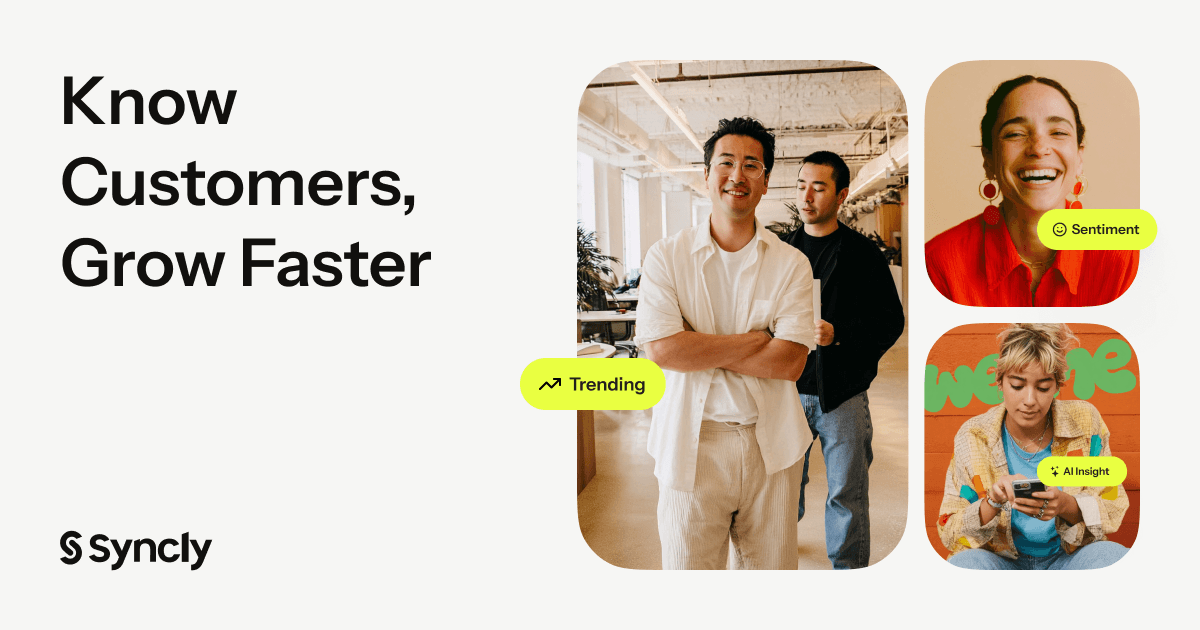
Syncly Brand: Colors, Fonts, Logo & Visual Identity
Syncly Brand Identity
A complete profile of Syncly's visual system — colors, typography, components, and personality — extracted from https://syncly.app/. Built for designers, agents, and AI tools.
Color Palette
Brand palette extracted from https://syncly.app/.
primary
#0000EE
secondary
#5C4C2D
accent
#1E1D1A
background
#FAFAF9
textPrimary
#1E1D1A
link
#E9FF41
Typography
Each font links to its Google Fonts page where available.
primary
Instrument Sans
Instrument Sans Google Fonts →
heading
Instrument Sans
Instrument Sans Google Fonts →
Visual Assets
Favicon
UI Components
Live previews rendered using Syncly's actual button styles.
Button Primary
- background: #1E1D1A
- textColor: #0000EE
- borderRadius: 100px
- shadow: rgba(30, 29, 27, 0.2) 0px 0px 1px 0.5px, rgba(0, 0, 0, 0.18) 0px 0.602187px 0.602187px -1.25px, rgba(0, 0, 0, 0.16) 0px 2.28853px 2.28853px -2.5px, rgba(0, 0, 0, 0.06) 0px 10px 10px -3.75px, rgba(30, 29, 27, 0.05) 0px 0px 0.5px 0.5px inset
Button Secondary
- background: #FFFFFF
- textColor: #0000EE
- borderRadius: 100px
- shadow: rgba(30, 29, 27, 0.2) 0px 0px 1px 0.5px inset, rgba(30, 29, 27, 0.05) 0px 0px 0.5px 1px inset
Brand Personality
Tone: modern
Energy: medium
Audience: business professionals
Syncly Brand in the Wild
Image Source: syncly.app
Image Source: syncly.app
Frequently Asked Questions
What is Syncly's primary brand color?
Syncly's primary brand color is #0000EE. It anchors the visual identity across their website, product UI, and marketing materials.
What accent color does Syncly use?
Syncly uses #1E1D1A as an accent color, typically applied to interactive elements like links, buttons, and call-to-action emphasis.
What font does Syncly use?
Syncly uses Instrument Sans as the primary typeface across body and headings.
Does Syncly use a light or dark theme?
Syncly's primary site uses a light color scheme, with a background of #FAFAF9.
How was this brand profile generated?
This profile was extracted from https://syncly.app/ using the Firecrawl branding extraction API, which inspects the live page's CSS, fonts, color tokens, and component styles.
Methodology
Brand data on this page was extracted from https://syncly.app/ on 2026-07-27 using the Firecrawl branding extraction API.
Machine-Readable Profile
Direct endpoints for agents, designers, and tooling. No login or auth required.
{
"colorScheme": "light",
"fonts": [
{
"family": "Instrument Sans",
"role": "body"
}
],
"colors": {
"primary": "#0000EE",
"secondary": "#5C4C2D",
"accent": "#1E1D1A",
"background": "#FAFAF9",
"textPrimary": "#1E1D1A",
"link": "#E9FF41"
},
"typography": {
"fontFamilies": {
"primary": "Instrument Sans",
"heading": "Instrument Sans"
},
"fontStacks": {
"heading": [
"Instrument Sans",
"sans-serif"
],
"body": [
"sans-serif"
],
"paragraph": [
"Instrument Sans",
"sans-serif"
]
},
"fontSizes": {
"h1": "72px",
"h2": "54.4px",
"body": "14px"
}
},
"spacing": {
"baseUnit": 4,
"borderRadius": "9px"
},
"components": {
"buttonPrimary": {
"background": "#1E1D1A",
"textColor": "#0000EE",
"borderRadius": "100px",
"borderRadiusCorners": {
"topLeft": "100px",
"topRight": "100px",
"bottomRight": "100px",
"bottomLeft": "100px"
},
"shadow": "rgba(30, 29, 27, 0.2) 0px 0px 1px 0.5px, rgba(0, 0, 0, 0.18) 0px 0.602187px 0.602187px -1.25px, rgba(0, 0, 0, 0.16) 0px 2.28853px 2.28853px -2.5px, rgba(0, 0, 0, 0.06) 0px 10px 10px -3.75px, rgba(30, 29, 27, 0.05) 0px 0px 0.5px 0.5px inset"
},
"buttonSecondary": {
"background": "#FFFFFF",
"textColor": "#0000EE",
"borderRadius": "100px",
"borderRadiusCorners": {
"topLeft": "100px",
"topRight": "100px",
"bottomRight": "100px",
"bottomLeft": "100px"
},
"shadow": "rgba(30, 29, 27, 0.2) 0px 0px 1px 0.5px inset, rgba(30, 29, 27, 0.05) 0px 0px 0.5px 1px inset"
}
},
"images": {
"logo": null,
"favicon": "https://framerusercontent.com/images/SHSe0paXnlzRVDzhGqd8VIKW38.png",
"ogImage": "https://framerusercontent.com/images/bVjAe6yi6J1008OgThx3qNMM1jA.png"
},
"personality": {
"tone": "modern",
"energy": "medium",
"targetAudience": "business professionals"
},
"designSystem": {
"framework": "custom",
"componentLibrary": ""
}
}