sync. Brand: Colors, Fonts, Logo & Visual Identity
sync. Brand Identity
A complete profile of sync.'s visual system — colors, typography, components, and personality — extracted from https://sync.so/. Built for designers, agents, and AI tools.
Color Palette
Brand palette extracted from https://sync.so/.
primary#2222FFrgb(34, 34, 255)
secondary#0000EErgb(0, 0, 238)
accent#0000FFrgb(0, 0, 255)
background#000000rgb(0, 0, 0)
textPrimary#000000rgb(0, 0, 0)
link#0000FFrgb(0, 0, 255)
Typography
Each font links to its Google Fonts page where available.
primary
Satoshi
Satoshi Google Fonts →
heading
Satoshi
Satoshi Google Fonts →
Visual Assets
Favicon
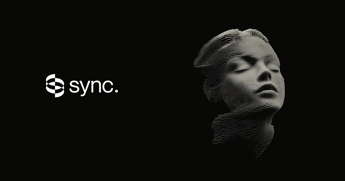
Social Card
UI Components
Live previews rendered using sync.'s actual button styles.
Button Primary
background: #0000FF
textColor: #0000EE
borderRadius: 10px
shadow: none
Button Secondary
background: #FFFFFF
textColor: #0000EE
borderRadius: 10px
shadow: none
Brand Personality
Tone: modern
Energy: high
Audience: content creators and media professionals
sync. Brand in the Wild
Image: framerusercontent.com
Source: sync.so
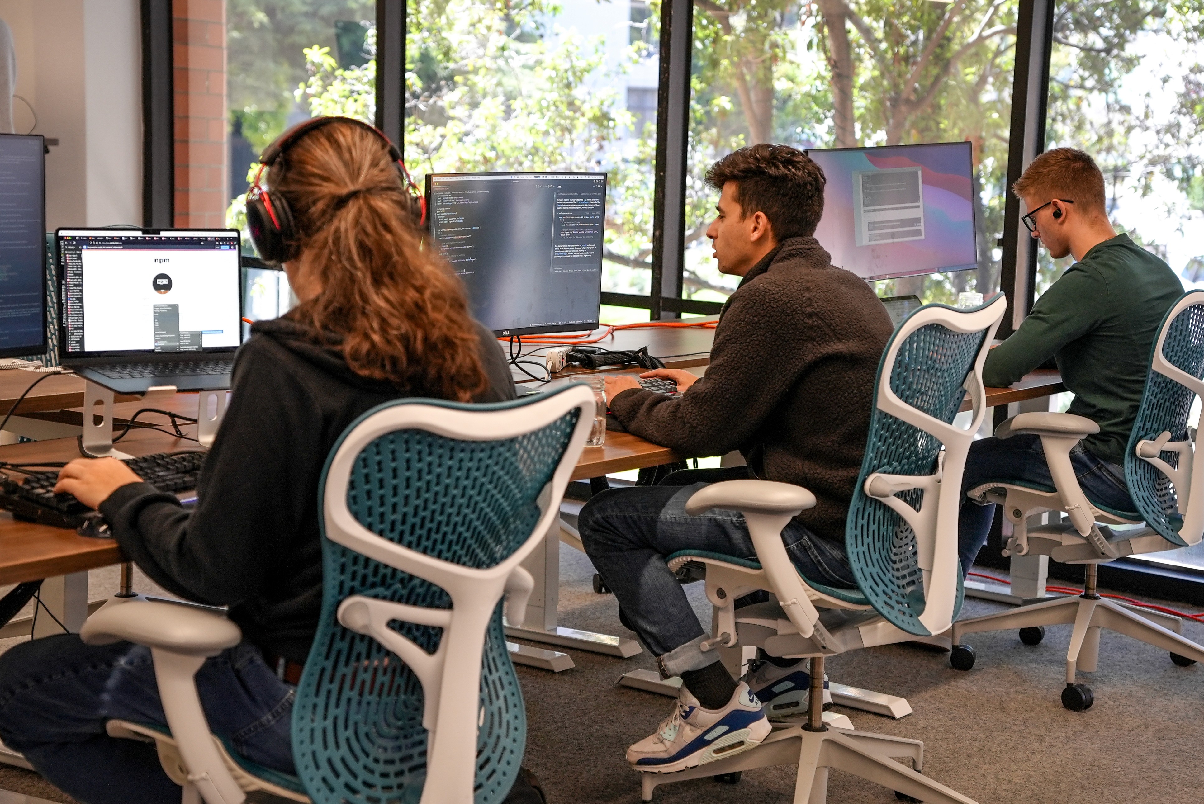
Image: framerusercontent.com
Source: sync.so
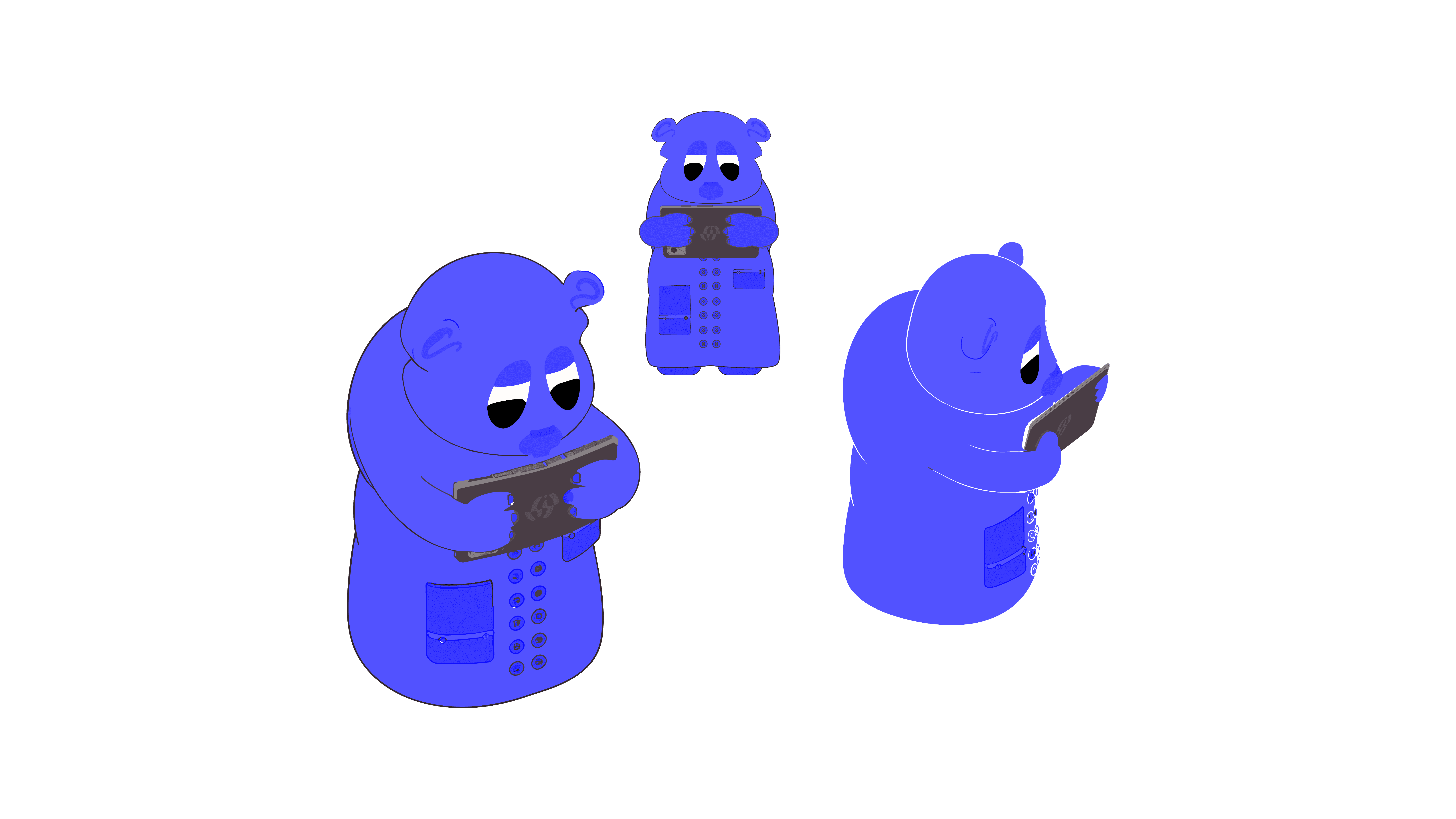
Image: framerusercontent.com
Source: sync.so
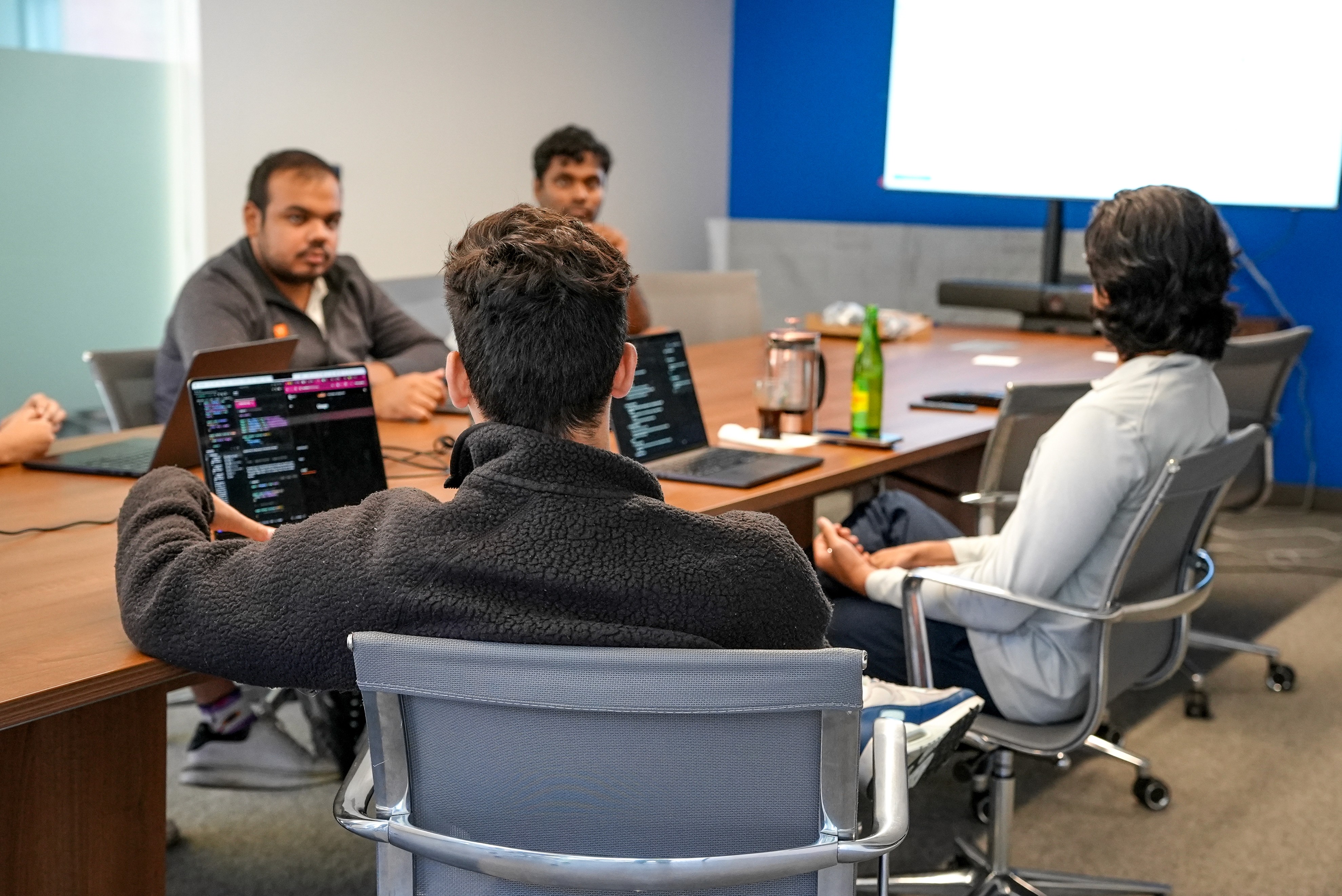
Image: framerusercontent.com
Source: sync.so
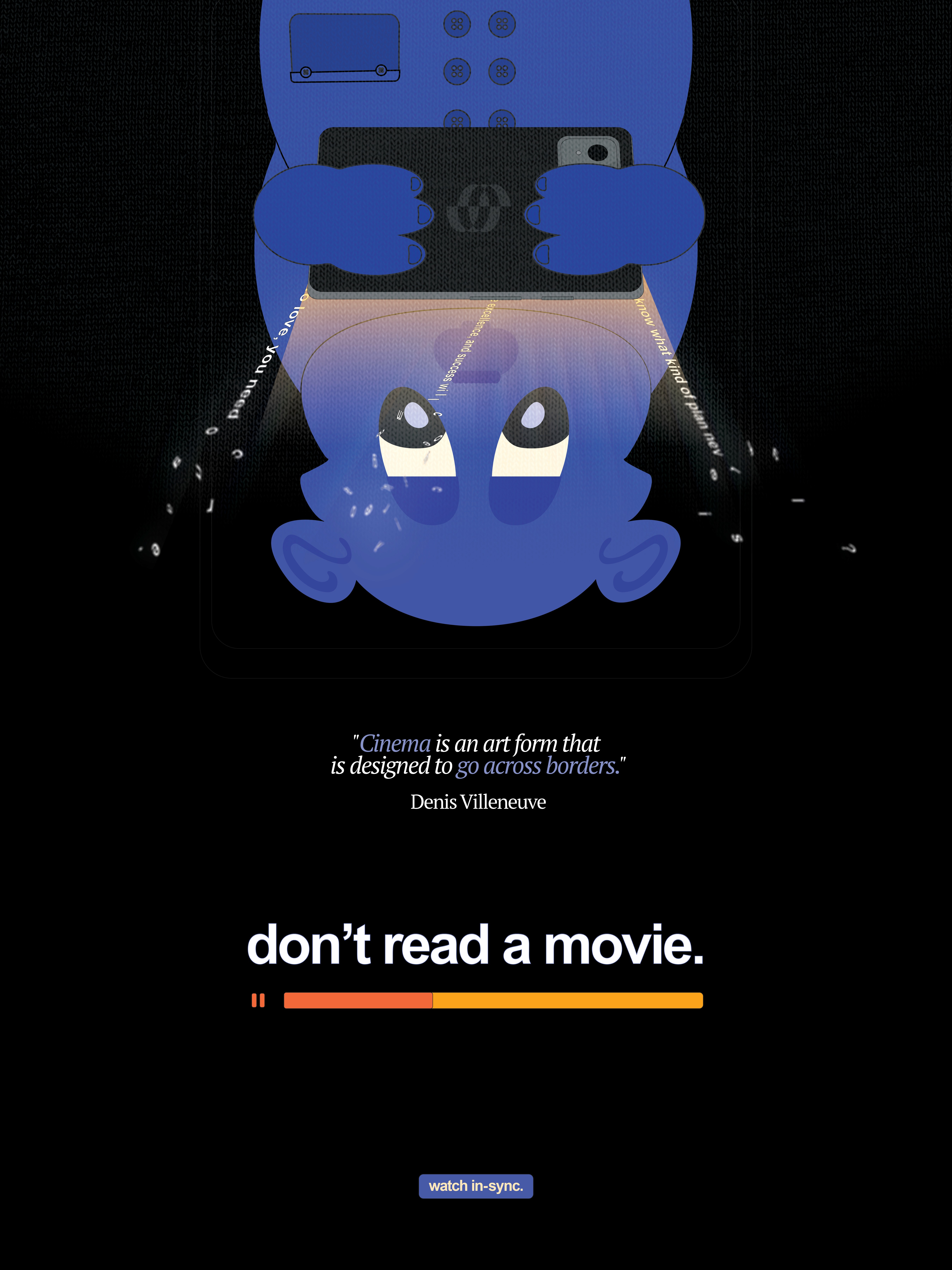
Image: framerusercontent.com
Source: sync.so
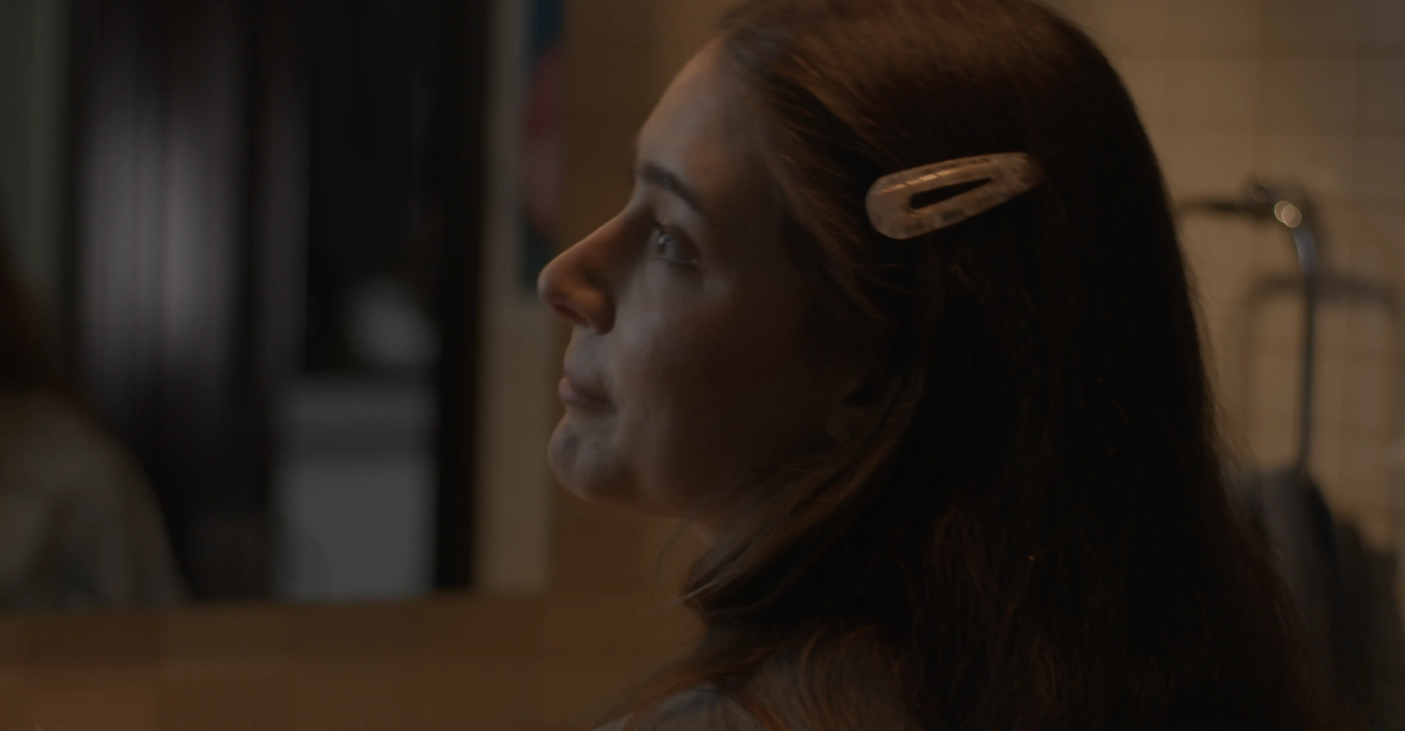
Image: framerusercontent.com
Source: sync.so
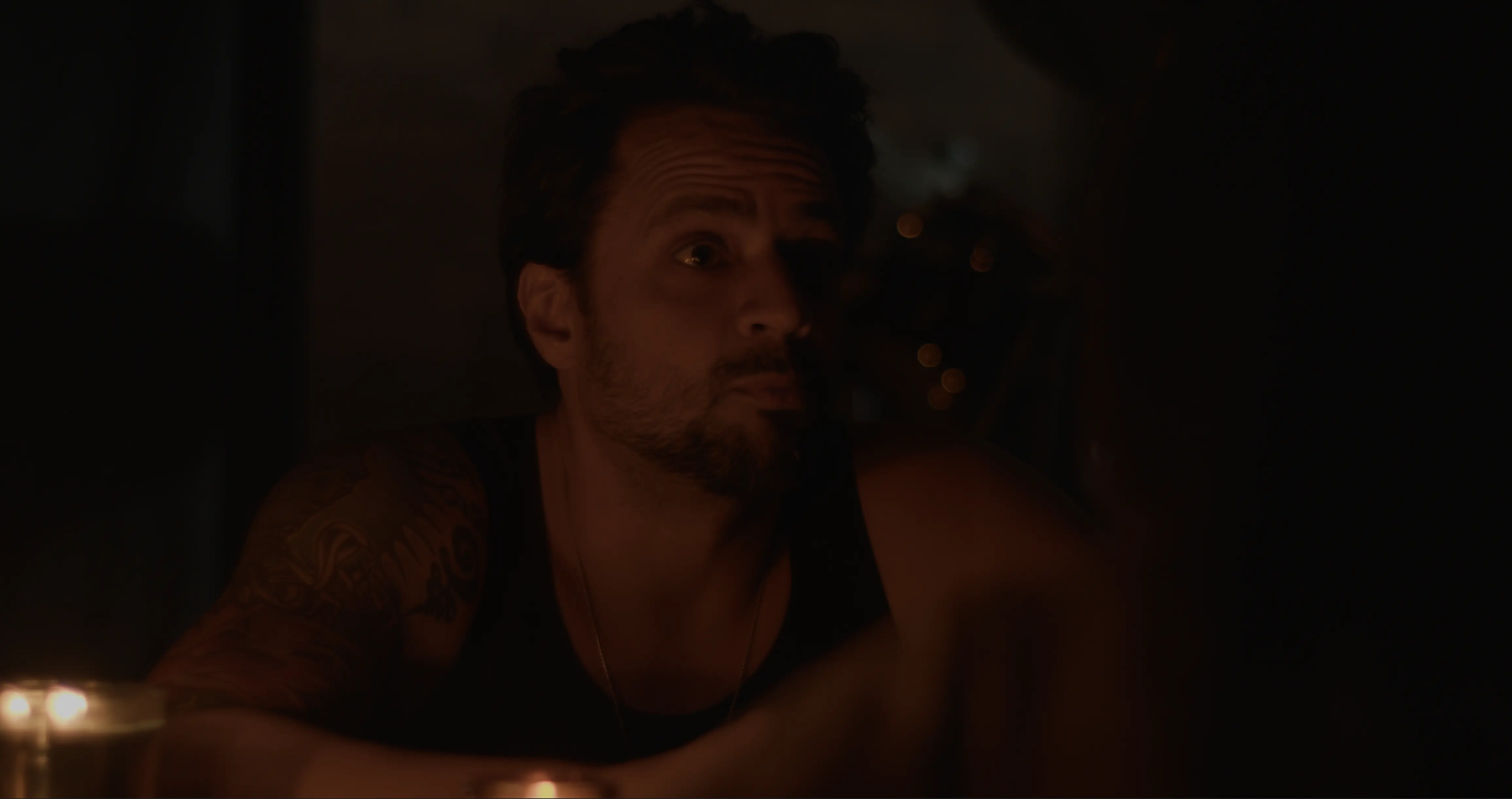
Frequently Asked Questions
What is sync.'s primary brand color?
sync.'s primary brand color is #2222FF. It anchors the visual identity across their website, product UI, and marketing materials.
What accent color does sync. use?
sync. uses #0000FF as an accent color, typically applied to interactive elements like links, buttons, and call-to-action emphasis.
What font does sync. use?
sync. uses Satoshi as the primary typeface across body and headings.
Does sync. use a light or dark theme?
sync.'s primary site uses a dark color scheme, with a background of #000000.
How was this brand profile generated?
This profile was extracted from https://sync.so/ using the Firecrawl branding extraction API, which inspects the live page's CSS, fonts, color tokens, and component styles. It is not affiliated with or endorsed by sync..
Methodology
Brand data on this page was extracted from https://sync.so/ on 2026-07-27 using the Firecrawl branding extraction API, which inspects each site's live CSS, font network requests, color tokens, and component styles. Brand-in-the-wild images were sourced via Google Image Search restricted to ad/webinar/report queries and link out to their original third-party publishers; we link to the source rather than re-hosting third-party content. This page is published by CharacterQuilt and is not affiliated with or endorsed by sync..
Machine-Readable Profile
Direct endpoints for agents, designers, and tooling. No login or auth required.
GET /branding/sync.json
GET /branding/sync/llms.txt
Design System
Colors
{ "primary": "#2222FF", "secondary": "#0000EE", "accent": "#0000FF", "background": "#000000", "textPrimary": "#000000", "link": "#0000FF" }
Typography
{ "fontFamilies": { "primary": "Satoshi", "heading": "Satoshi" }, "fontStacks": { "heading": ["sans-serif"], "body": ["sans-serif"], "paragraph": ["Satoshi", "sans-serif"] }, "fontSizes": { "h1": "12px", "h2": "12px", "body": "19.2px" } }
Spacing
{ "baseUnit": 10, "borderRadius": "10px" }
Components
{ "buttonPrimary": { "background": "#0000FF", "textColor": "#0000EE", "borderRadius": "10px", "shadow": "none" }, "buttonSecondary": { "background": "#FFFFFF", "textColor": "#0000EE", "borderRadius": "10px", "shadow": "none" } }
Images
{ "favicon": "https://framerusercontent.com/images/0Xql4PYHN997ZZPpnWpWkPU9uI.png", "ogImage": "https://framerusercontent.com/images/PghwfooHur1iNOOG3o8QlutoPs.png" }

Personality
{ "tone": "modern", "energy": "high", "targetAudience": "content creators and media professionals" }
Confidence
{ "buttons": 0.95, "colors": 0.9, "overall": 0.925 }